
October 6, 2025
Accessibility, UX Research
Landscape Analysis of DELIVERY APPS
Analyzed the three platforms through heuristic evaluations and landscape analysis. My work focused on identifying usability strengths and weaknesses, highlighting opportunities to improve navigation and accessibility. By breaking down how each service structures information, we created a clearer picture of the overall user experience across the food delivery industry.

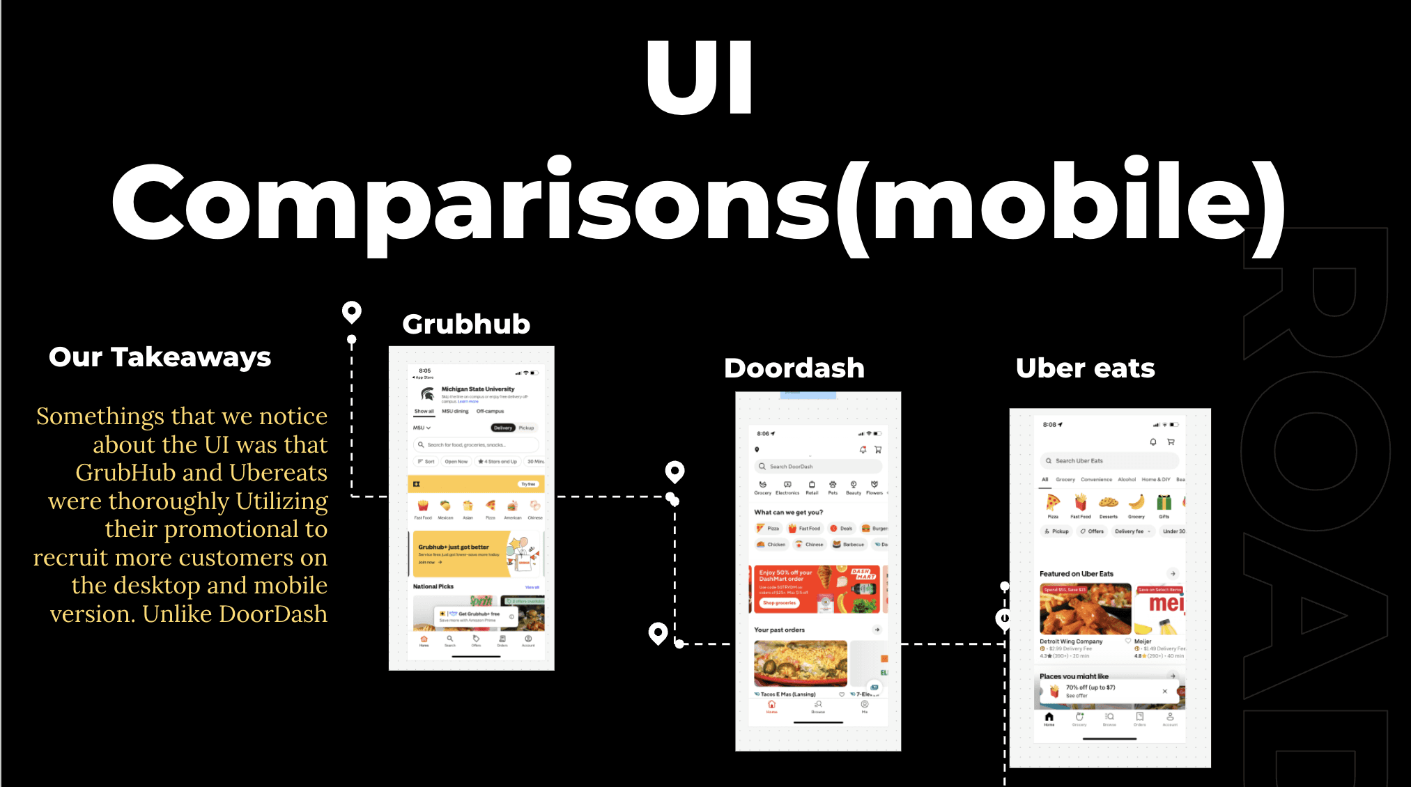
Conducted heuristic evaluations of DoorDash, Uber Eats, and Grubhub
Compared navigation flow, accessibility, and content structure
Collected insights through screenshots, notes, and accessibility tools
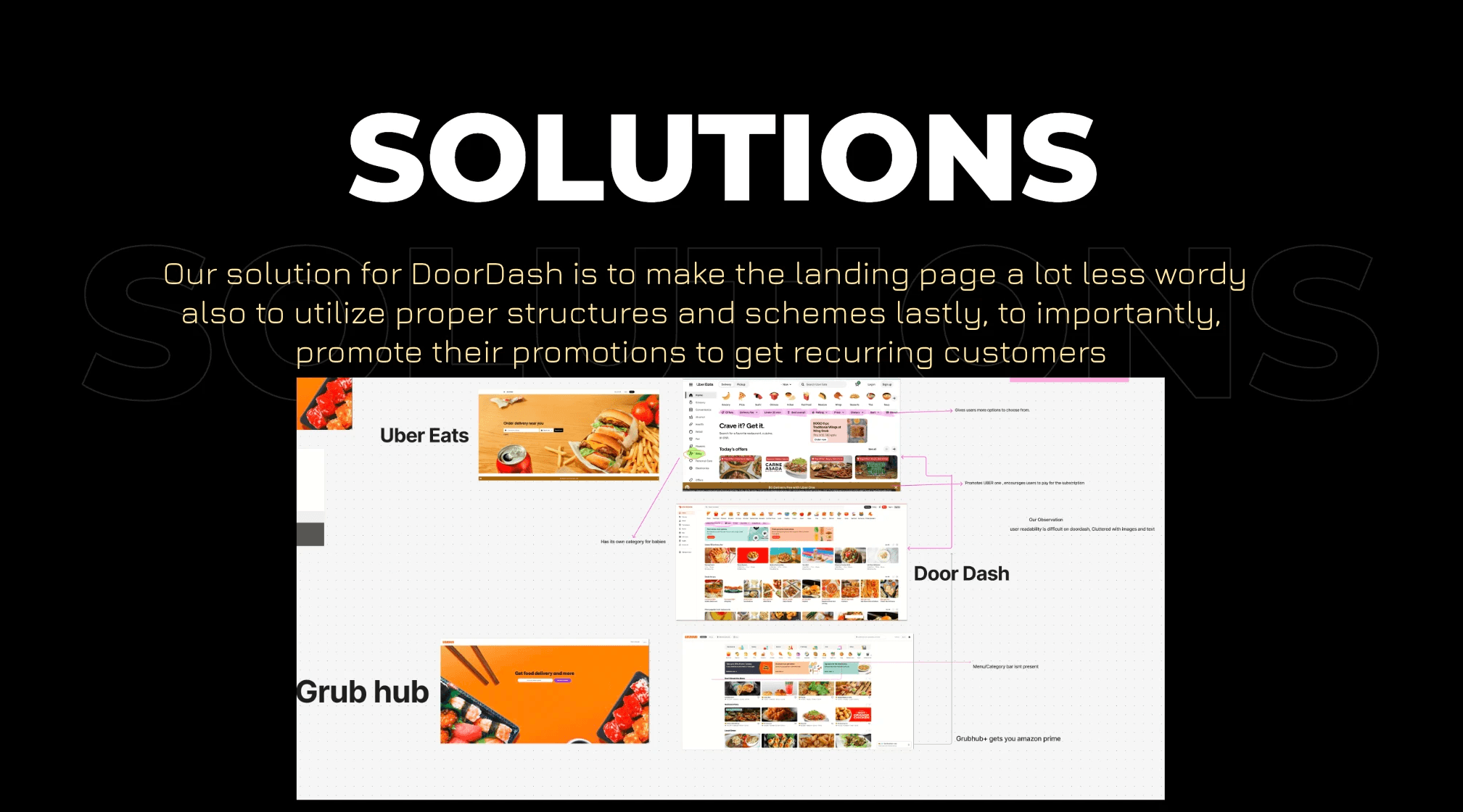
Synthesized findings into goals, challenges, and recommendations
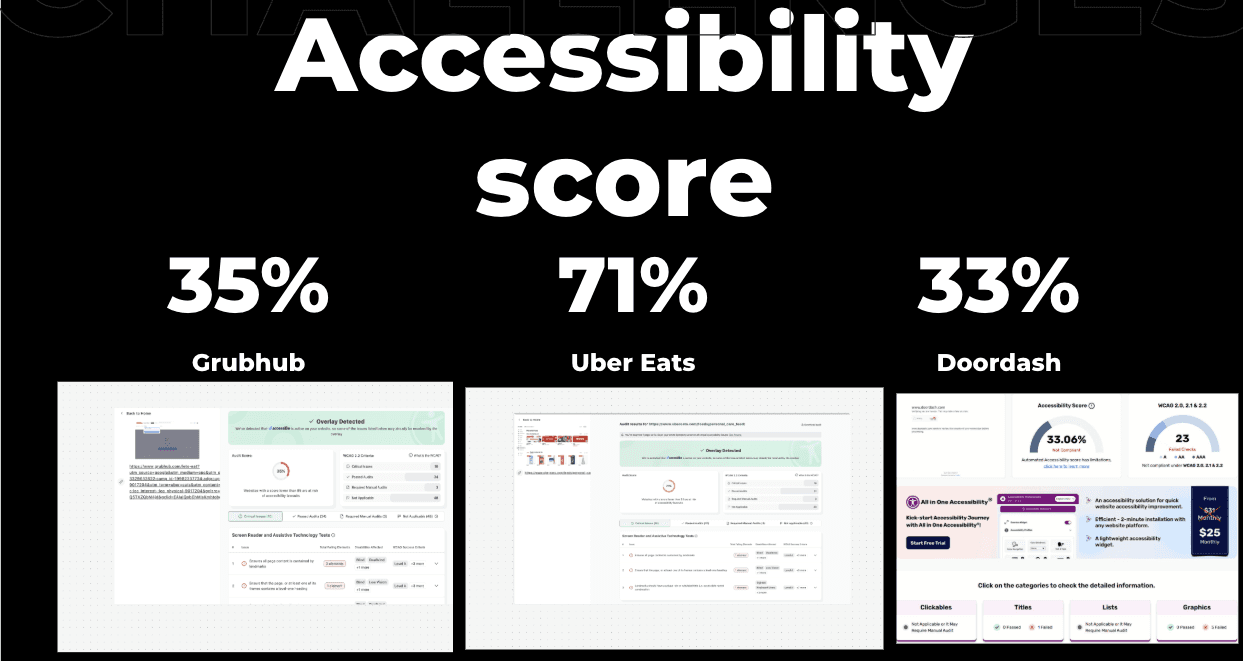
Through my first views of the Doordash website, I noticed that in certain areas there was a bright red text that seemed difficult to read along with a light grey text that was not very visible. I claimed that it was not accessible, and running the website through an accessibility analysis, there were 7 failures in the contrast ratio. In my opinion, Doordash needs to put more consideration into making their experience more accessible and usable for the larger public, especially when their second largest competitor in terms of market share(Uber Eats) has an accessibility score of 71% compared to Doordash’s 31%. Food delivery services can be an extremely useful tool, especially for individuals who may have vision impairments that may not have abilities to travel to acquire food. However, if Doordash has a large amount of contrast ratio issues along with images not having alternative descriptions, it defeats the convenience of the service for vision impaired individuals.