
April 15, 2025
UX Research
M.S.U. Arts Research
In this project, I conducted a series of research methods including heatm
apping, click-rate analysis, and A/B testing to deliver the best possible product for MSU Arts and increase overall engagement on the Website

Research Process & Methodology
I broke my research into three phases, where each one built on what I learned before. This let me go from spotting problems to figuring out what actually needed to be fixed.
Phase 1: Analytics Review
I started by looking at the website data Morgan and her team had already collected at Arts MSU. This gave me a baseline for how people were using the site and where they were running into issues. Pretty quickly, I spotted four main problems: the dropdown navigation, typography, icon sizes, and the color scheme. All of these were making it harder for users to find what they needed.
Phase 2: Accessibility Testing
Next, I ran an accessibility audit using an Accessibility Checker to see how the site stacked up against WCAG standards. This showed me not just where the site was doing okay, but where it was really falling short.
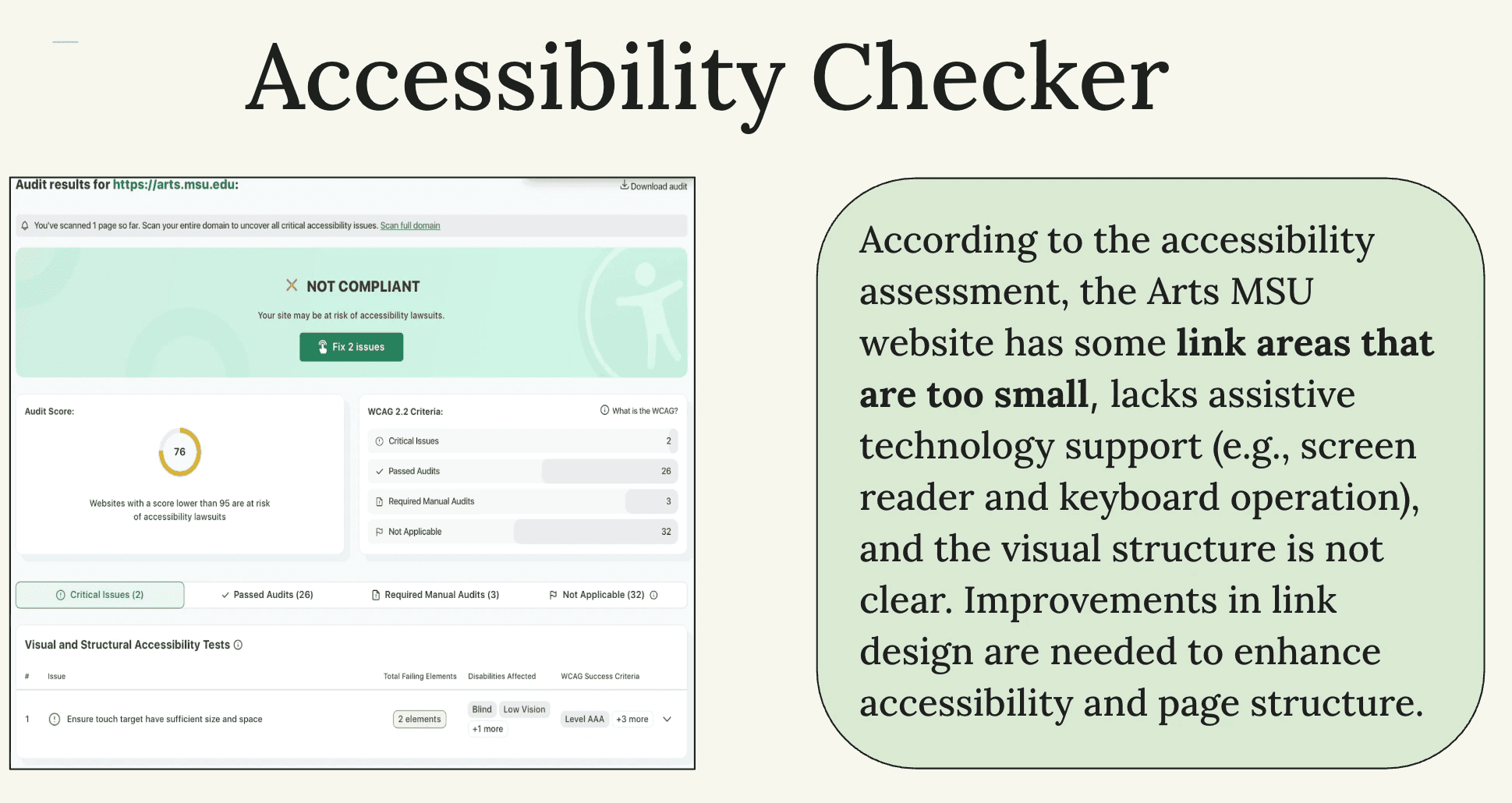
The audit found some serious issues. A lot of clickable areas were too small for people with motor disabilities or anyone on mobile. There wasn't great support for assistive technology, so screen-reader users and keyboard navigators were struggling. The visual hierarchy was unclear, which made pages hard to scan. And links looked too similar to regular text, so people couldn't tell what was clickable.
These issues weren't just affecting users with disabilities—they were creating friction for everyone, especially on mobile.
Phase 3: A/B Testing With Real Users
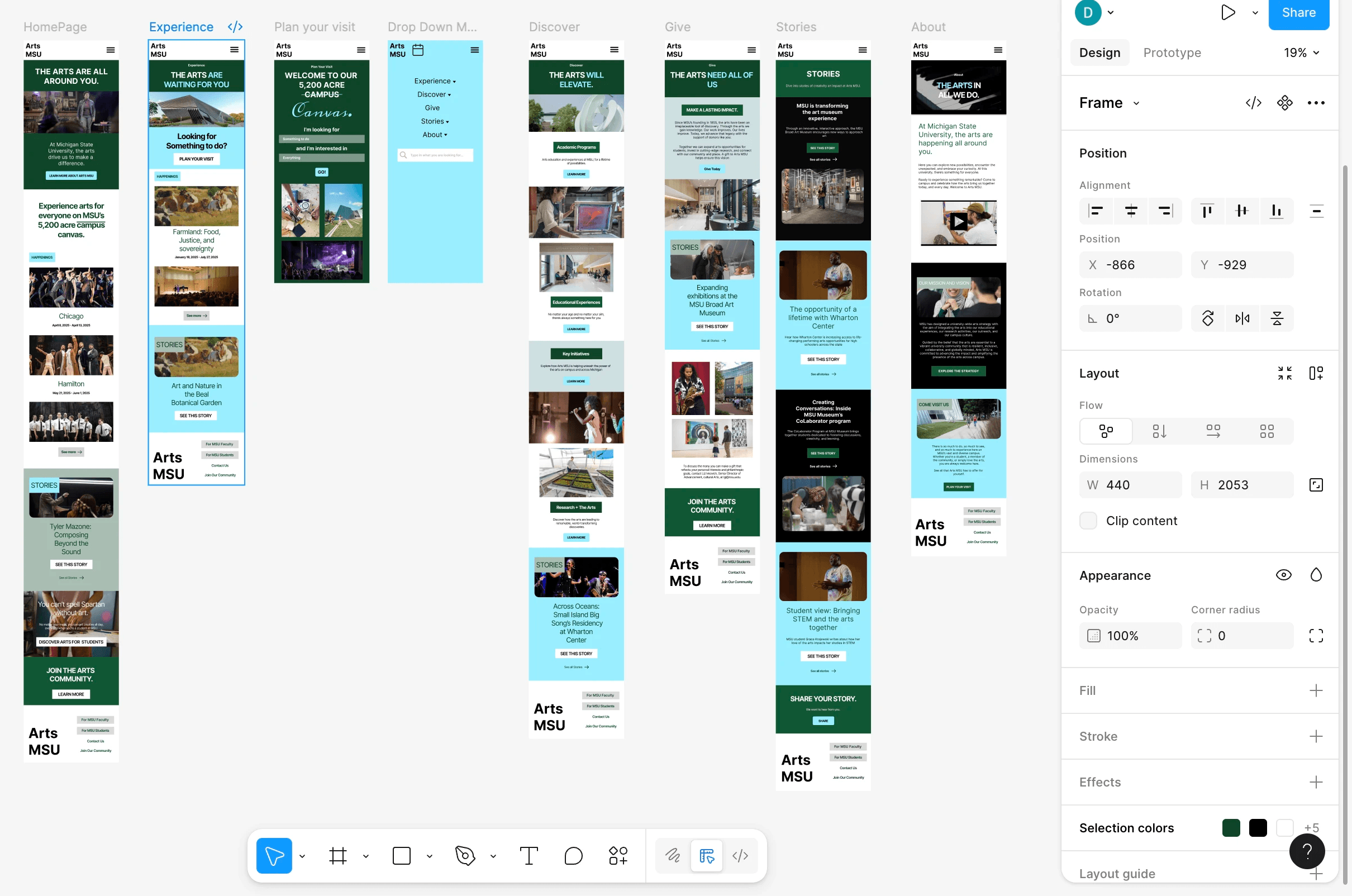
After making mobile and desktop mockups based on what I'd learned, I set up an A/B test through Lyssna. I compared the original site to my redesigns and collected data through surveys, heat maps, and click-tracking.
The survey had three parts: questions about how people like to get updates, hands-on interaction with my prototypes, and follow-up questions about usability. This gave me a full picture of how users actually experienced the redesign.
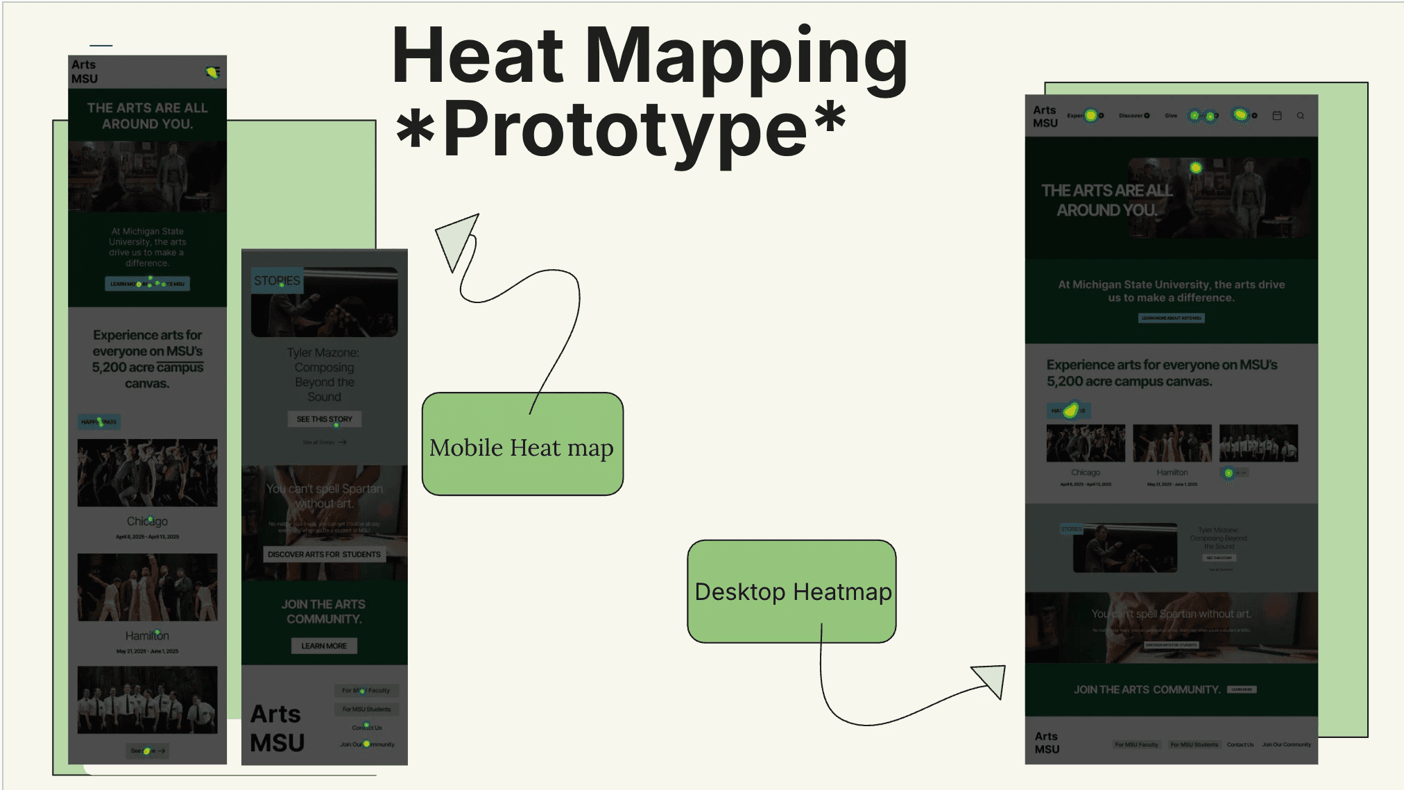
Heat Mapping & Click-Rate Analysis
I used heat mapping and click-tracking to see what users were actually doing, not just what they said they were doing.
Heat maps show where people focus their attention warmer colors mean more engagement, cooler colors mean people are ignoring that area. On mobile, the heat maps showed users were drawn to the redesigned dropdown menu and calendar feature, which meant they could find them easily. On desktop, activity clustered around the bigger header icons and the new visual hierarchy, confirming those changes worked.
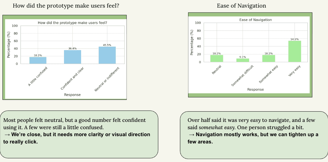
Click-rate analysis showed me exactly where users clicked, how often, and what paths they took. On the original site, users hesitated, mis-clicked, and took roundabout routes through the menus. On my redesign, their clicks were way more direct and efficient. They found content faster, completed tasks in fewer steps, and seemed way more confident navigating.
Together, these tools validated my design decisions icon sizing, button placement, visual hierarchy, dropdown structure and caught subtle issues that surveys alone would've missed. This behavioral data made my recommendations stronger and proved the redesign actually worked better, not just in theory.
What I Discovered
The Awareness Problem
The biggest surprise came from my outreach questions: 58% of people didn't even know the Arts MSU website existed. That completely reframed the project. I wasn't just redesigning a website I was redesigning something that people needed to know about first.
When I asked how they preferred to get updates, 50% said email or newsletters and 33% said social media, especially Instagram. And here's the key part: 92% said newsletters or updates would make them more likely to attend Arts MSU events. People were interested—they just didn't know about it.
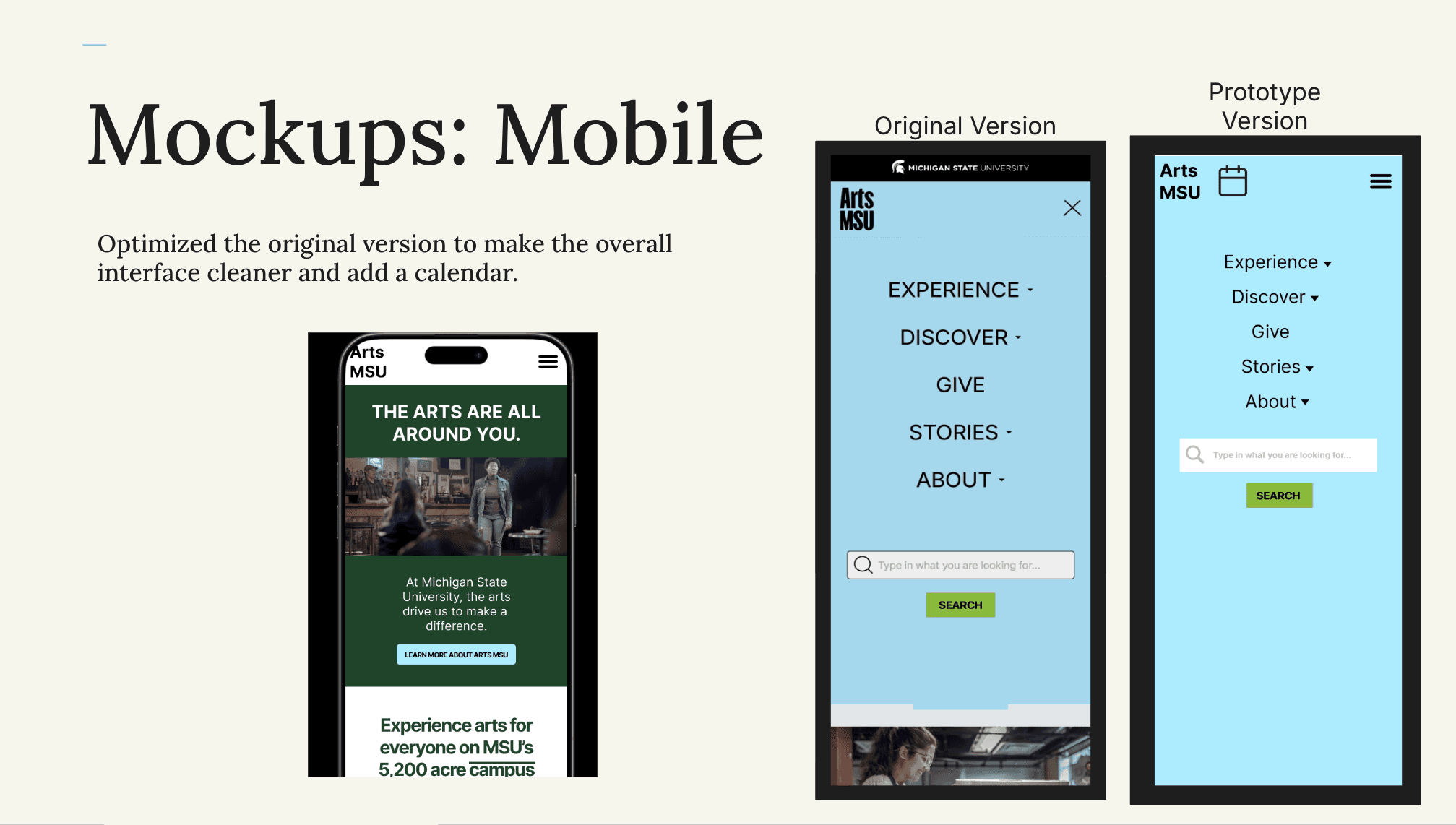
Mobile Design Feedback
Users liked the new mobile dropdown menu 50% rated it very easy to use. But the color scheme got mixed reactions. Half preferred my new palette, but others felt disconnected from the Arts MSU identity. This showed me there's tension between meeting accessibility standards and keeping the brand feel intact.
Desktop Design Feedback
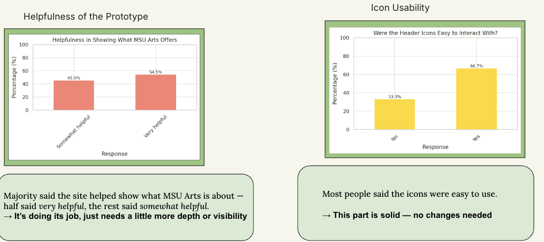
Desktop testing showed similar results. The larger icons were a huge improvement—67% of users found them easier to click and navigation was clearer overall. But again, the color scheme was an issue. Even though it met WCAG contrast requirements, users didn't feel connected to it emotionally.
Heat Mapping & Click-Tracking Insights
Heat maps confirmed users naturally gravitated toward the elements I redesigned, like the new navigation menu and header icons. Click-tracking showed they completed tasks faster and more accurately than on the original site. So structurally, my decisions were working.
The one consistent problem across both versions? Color. Users understood the layout better, but many felt the palette was bland or didn't match the Arts MSU brand.
The Accessibility–Appeal Dilemma
This was one of the biggest lessons from the project. Making something accessible and making it appealing don't always go hand in hand. My colors passed every WCAG requirement and worked for colorblind users but people still felt disconnected from them.
This is a real UX challenge: compliance gets you usability, but not necessarily delight. You need both, which means more testing, more creativity, and a deeper understanding of the brand.
Design Solutions I Implemented
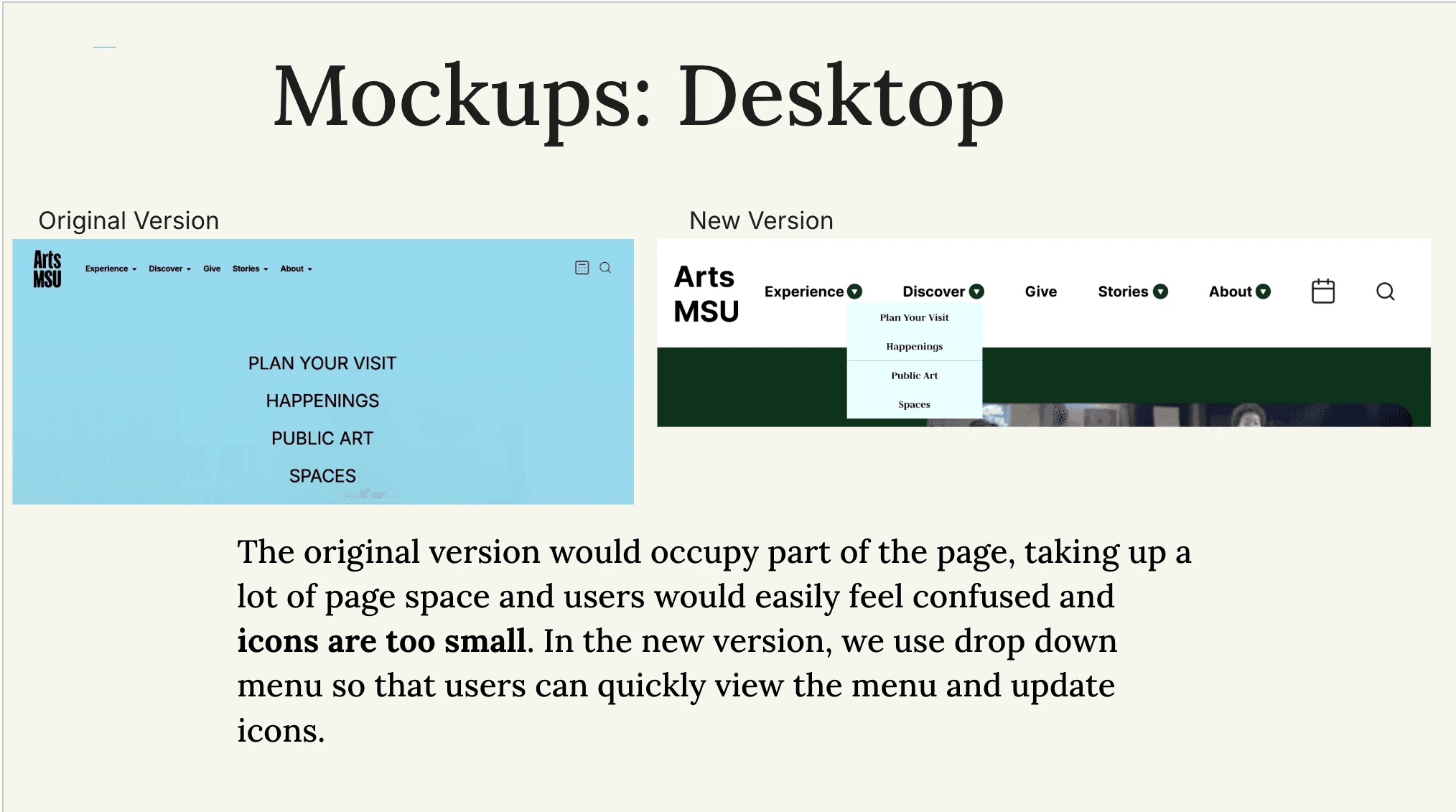
Using everything I learned, I created mobile and desktop mockups that fixed navigation issues, clarity problems, and accessibility barriers. On mobile, I simplified the interface, reduced mental load, added a calendar feature, made touch targets bigger, and improved the layout flow. On desktop, I replaced the cluttered navigation with a clean dropdown system, made icons bigger, refined the typography hierarchy, and restructured the layout so it was easier to scan.
These weren't random aesthetic choices each decision was backed by analytics, accessibility findings, and behavioral testing.
Recommendations & Next Steps
Based on everything I found, here's what I recommended:
Fix the awareness gap with email campaigns and Instagram posts
Use the redesigned dropdown menu, which consistently performed better than the original
Improve button contrast so people can immediately tell what's clickable
Do more research on color options that work for both accessibility and emotional connection
The color piece is especially important. Accessibility alone isn't enough the palette needs to be clear and feel like the brand.
What I Learned
This project taught me how powerful it is to sequence your research methods intentionally. Analytics showed me the problems, accessibility testing revealed the barriers, and A/B testing with behavioral data let me evaluate solutions. Each method gave me different insights, and together they gave me the full picture.
I learned that accessibility and aesthetics can clash, and solving that takes creativity, not just following guidelines. I learned that qualitative feedback matters just as much as the numbers data explains what people do, but comments explain how they feel. And I learned that even the best design doesn't matter if people don't know it exists.
A website's success isn't just about good design. It's about discoverability, communication strategy, and making sure people actually know you're there.